Seasonal Coloring Pages: Spring, Summer, Autumn & Winter Themes
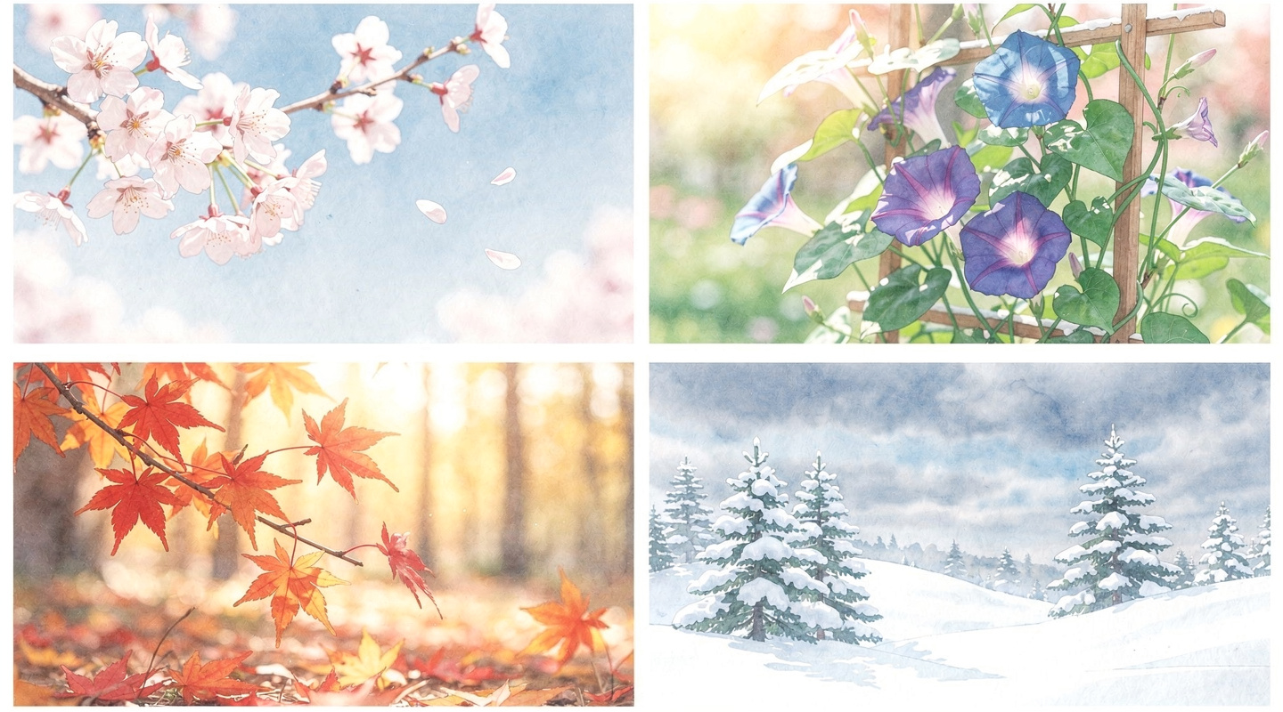
“I never know which coloring page to choose.” “I keep coloring the same kinds of pictures over and over.” — Does that sound familiar? One of the best ways to keep your coloring practice fresh and exciting is to choose designs that match the current season. Cherry blossoms in spring, fireworks in summer, autumn leaves in fall, snow in winter — when the scene outside your window matches what’s on your coloring sheet, the experience becomes truly special.
In this article, we’ll walk you through our favorite coloring page themes for each of the four seasons — spring, summer, autumn, and winter — along with suggestions tied to traditional holidays and festivals. We hope it gives you plenty of ideas for how to enjoy coloring all year long.

Yuki

Shio
Your Choice of Line Drawing Shapes the Whole Experience
The joy of coloring lies in choosing your own colors. But the subject of your coloring page — the line drawing itself — matters just as much. There’s a real difference between reaching for a page with a vague sense of “well, it’s just another flower” and picking one up with purpose: “Today I want to paint an autumn scene.” The second approach invites a completely different kind of focus.
Choosing seasonal themes offers a simple advantage: because you’re tuned in to what’s happening outside, each coloring session feels fresh. And when you display your finished work, it becomes a natural conversation starter — “Oh, you made that for autumn!” It gives your artwork its own story.
For many people in their 60s and 70s, seasonal coloring pages have a nostalgic quality too. Scenes that echo childhood memories — a festival, a snowfall, a summer garden — can bring back warm feelings and even open up conversations with family members about the past.
Spring Coloring Pages — Cherry Blossoms, Flower Fields, and Hinamatsuri
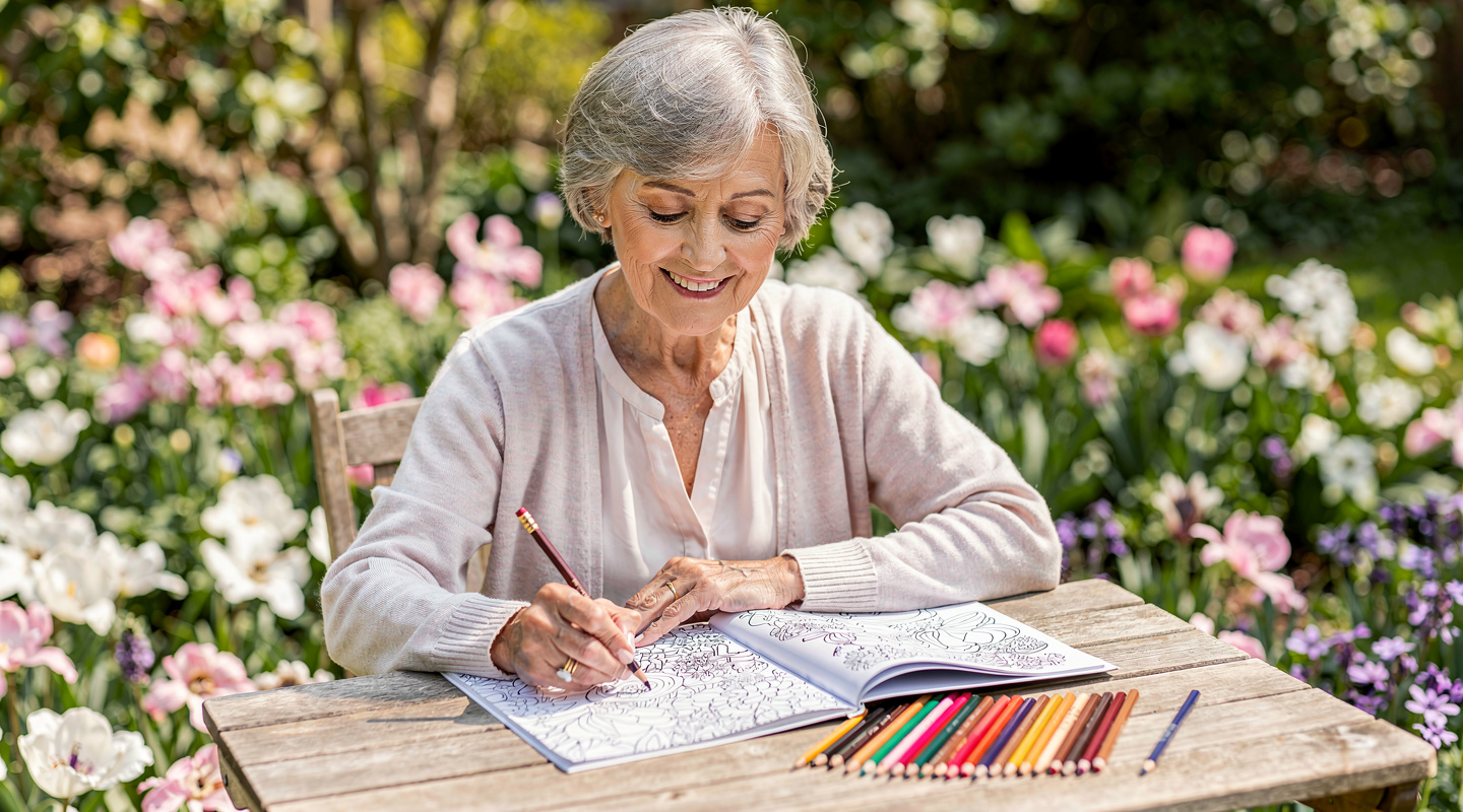
When it comes to spring, cherry blossoms are the undisputed favorite. There are so many ways to approach them — a full canopy of branches in bloom, petals drifting on the breeze, reflections floating on a pond. No matter which angle you choose, the finished piece captures something tender and fleeting. Try starting with a pale pink base and adding a soft violet to the petals in shadow for a sense of depth.
Beyond cherry blossoms, tulips and rapeseed fields are classic spring themes that practically glow on the page. Their bold yellows and greens create cheerful contrast. In March, try a Hinamatsuri (Doll Festival) design — the empress and emperor dolls, peach blossoms, and layered fabrics offer plenty of detail to color carefully. Finishing the elaborate patterns on the kimono is one of those slow, satisfying challenges that makes coloring so rewarding.
Spring colors call for softness. Whites, creams, pale pinks, light yellows, and mint greens all work beautifully together. Let the palette breathe, and you’ll end up with something that genuinely feels like spring.
Summer Coloring — Morning Glories, Fireworks, and the Sea
Summer is the season to be bold. Morning glories in vivid purple and blue, fireworks blazing gold and red, the deep turquoise of the sea — this is the time of year when saturated, lively colors feel completely at home on the page.
Morning glories are a quintessential summer motif in Japan. Their twisting vines and trumpet-shaped blooms make for a beautiful composition, and they’re especially good for practicing gradients. Going from deep purple at the outer edge to soft pink at the center creates a lovely effect — try different combinations and see which speaks to you.
For fireworks designs, try coloring the background first in deep blue or navy before filling in the bursts of light. It’s the reverse of how you might normally approach a page, but the result — glowing color against a dark sky — can be surprisingly dramatic. Looking at a finished fireworks page often brings back the warm, dusty smell of summer festival nights.
Other great summer themes: sunflowers, the ocean with sailing boats, watermelons at a summer picnic, and shaved ice in tall glass dishes.
What Color Is Autumn? — Maple Leaves, Cosmos, and Moon Viewing
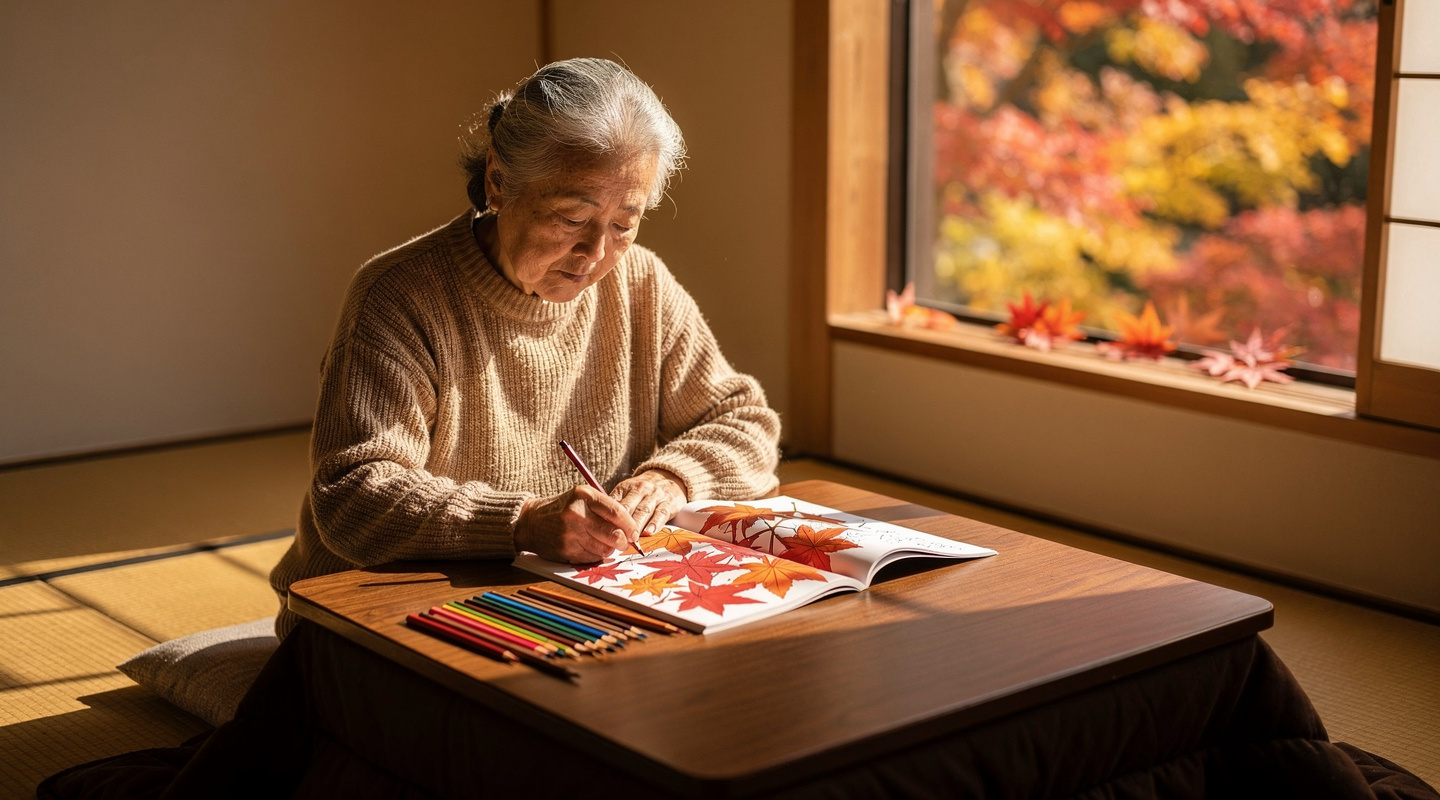
Autumn may be the richest season for coloring. Maple leaf designs invite you to work with complex gradients — a single leaf can move from bright red at the tip through orange and yellow to green at the stem. If you have real leaves nearby, try studying them as you color. The results tend to feel more alive when you draw from observation, even just loosely.
Cosmos flowers are a gentler autumn option, and very approachable for beginners. Their slender petals are simple to fill in, and you can ring the changes freely — pale pink here, deep rose there, a white one in the corner, a lavender one peeking through. Add a wash of pale blue or sky color in the background, and you’ll capture that particular clarity of an autumn sky.
September calls for a moon-viewing (Tsukimi) design — a full moon rising over pampas grass, with rabbit shapes nestled in its glow. It’s a nostalgic scene that resonates deeply with many Japanese households. The moon can be soft yellow, warm white, or even a muted amber — each one has its own quiet beauty.
For autumn palettes, anchor yourself in warm tones: reds, oranges, and golds as the primary colors, with touches of deep brown and forest green to give them weight.
The Quiet of Winter — Snow, Christmas, and New Year’s
Winter coloring has a stillness unlike any other season. Snow scene designs remind us that sometimes the most powerful choice is what you don’t color. Leaving areas of the page white — the accumulated snow on rooftops, the drifts along a fence — creates softness and space that paint simply can’t match.
In December, Christmas designs are enormously popular. Trees strung with lights, holly wreaths, Santa and his reindeer — the combination of red, green, and gold is warm and festive, and there’s a particular joy in coloring a Christmas scene to give as a gift. Many people color a page with their grandchildren and frame the result for the mantelpiece.
New Year’s designs are a lovely way to ring in January. Gate pine decorations, rice-cake offerings, Mount Fuji at sunrise, and other auspicious symbols make for coloring pages with a ceremonial feeling. Hang your finished work in the entryway of your home, and it becomes a handmade New Year’s decoration — something no store-bought ornament can quite replicate.
Winter palettes lean on blues, whites, and grays to suggest cold and quiet. For Christmas, bring in reds and golds to warm things up; for snow scenes, trust the white of the page to do much of the work.

Yuki
Shio
Coloring with the Calendar — Holiday Themes All Year Round
Beyond the four seasons themselves, Japan’s rich calendar of holidays and festivals offers a coloring theme for almost every month. Planning ahead means you’ll rarely find yourself wondering what to color next.
- January — New Year’s, first sunrise, calligraphy
- February — Setsubun (bean-throwing festival), Valentine’s Day
- March — Hinamatsuri (Doll Festival), spring equinox
- April–May — Flower viewing, Children’s Day, Boys’ Festival carp streamers
- July — Tanabata (Star Festival), Obon, summer fireworks
- September — Moon viewing, Respect for the Aged Day
- October — Halloween (pumpkins and friendly ghosts make charming pages)
- November–December — Autumn leaf viewing, Christmas, year-end
Tanabata designs deserve a special mention. Bamboo branches hung with paper wishes, the Milky Way stretching across the night sky, the Weaver Star and the Cowherd Star meeting just once a year — these images have a poetic quality that lends itself beautifully to careful coloring. Try deep blues and indigos for the sky, with silver and gold for the stars, and the page takes on an almost magical quality.
Keeping a loose coloring calendar — one or two themes per month — is a simple habit that makes it easy to stay engaged and keep discovering new images to explore.
Creating Your Own Seasonal Coloring Pages with AI
Have you ever wished you could color a scene from your own memory? The cherry tree outside the house you grew up in. The summer festival in your hometown. The mountain view from your window on a winter morning. These aren’t scenes you’ll easily find in a coloring book — but with AI-powered apps, you can bring them to life.
Modern AI image tools can generate custom line drawings from a short text description. You don’t need any artistic skill — just a few words about what you’d like to see, and the app creates a one-of-a-kind coloring page for you. It’s a genuinely new way to make coloring personal.
Being able to generate a new seasonal design whenever you want means your coloring practice can keep growing indefinitely. There’s always a new theme waiting, a new color combination to try, a new memory to explore through color.
Yuki
Shio
Start Your Seasonal Coloring Journey with IROTSUNA
IROTSUNA is a coloring app designed with seniors in mind. You can generate AI coloring pages on seasonal themes — spring flowers, summer festivals, autumn leaves, winter snow — and color them directly on your smartphone. When you’re happy with your work, you can share it in the in-app gallery, where other members can leave encouraging comments and likes.
Whether you want to try your first cherry blossom coloring page or create a custom scene from a personal memory, IROTSUNA brings it all together in one simple app. The text is large, the interface is clear, and everything is designed to feel welcoming — even if this is your first time coloring on a phone.
Let the seasons guide your coloring, and let IROTSUNA bring those colors to life. Download free on the App Store.